Navigation & Signing In
Signing in
Any page you open without a session redirects to the sign-in screen and returns you to where you were going afterwards. The card shows your instance's logo and name with Email and Password fields; a failed attempt reads "Login failed. Check your credentials."
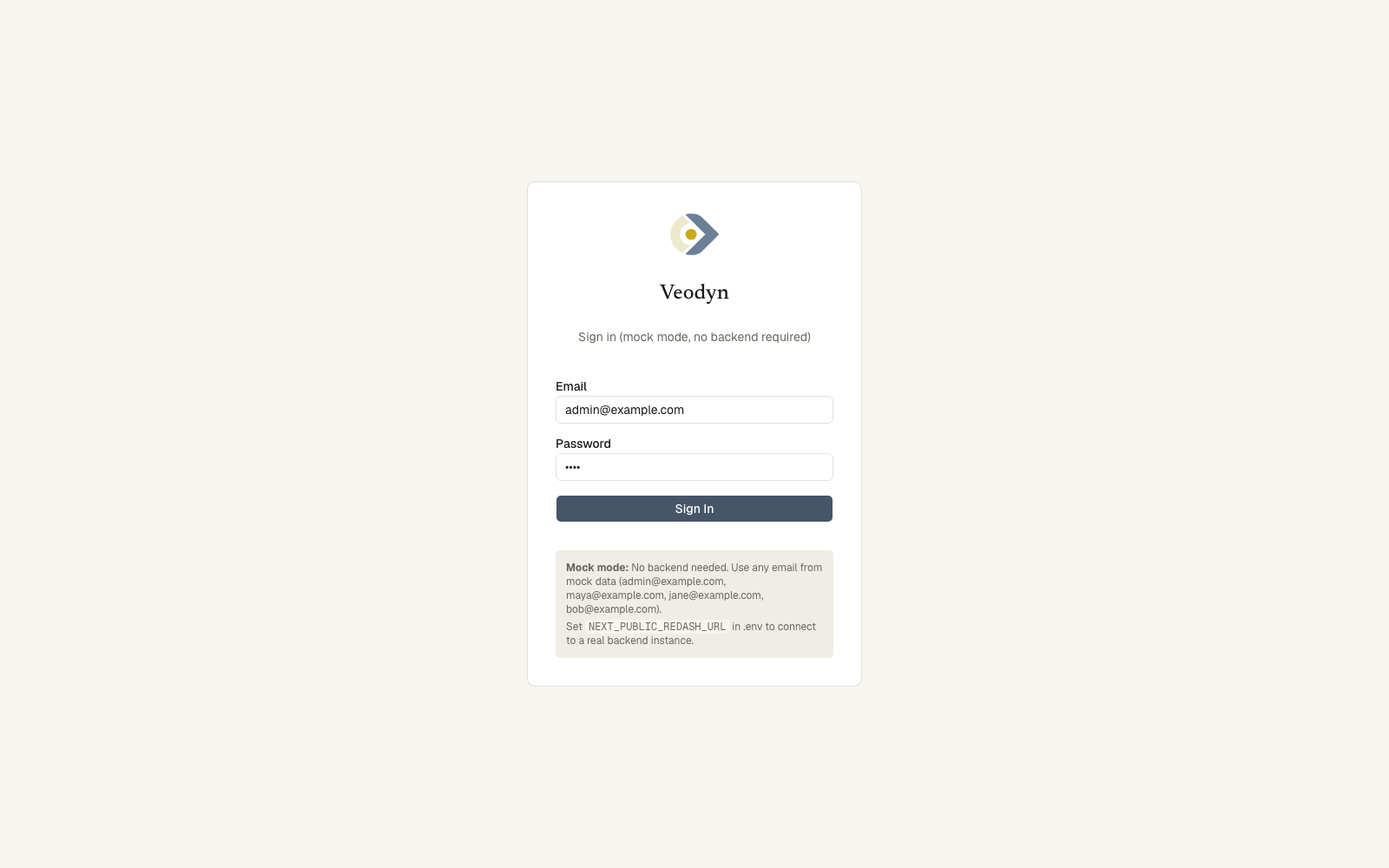
The redirect carries where you were going, so signing in returns you there rather than to the home page.
Account lifecycle flows are link-driven, and both use the same screen with different wording:
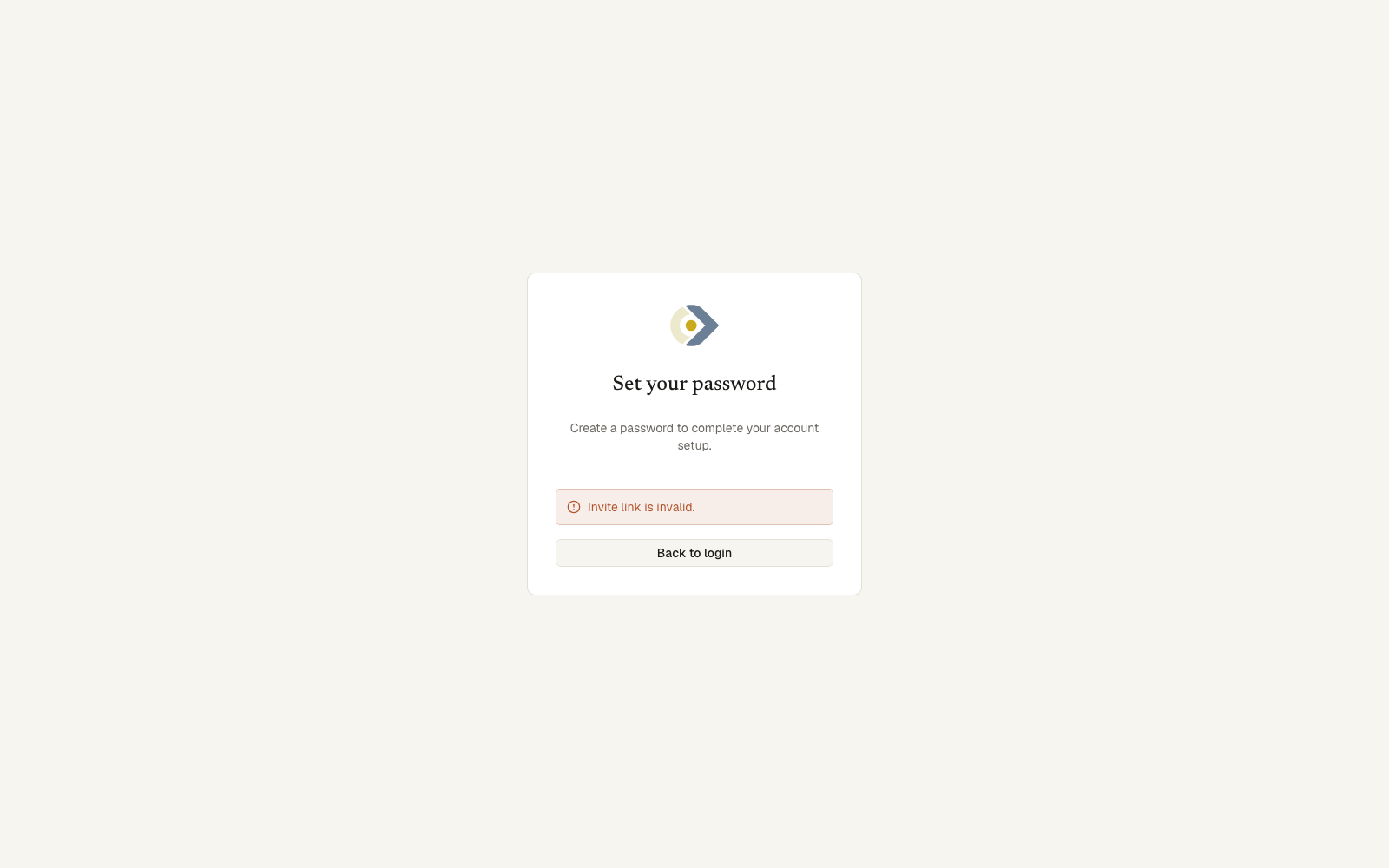
| Link | Heading | Button |
|---|---|---|
| Invitation | Set your password | Activate account |
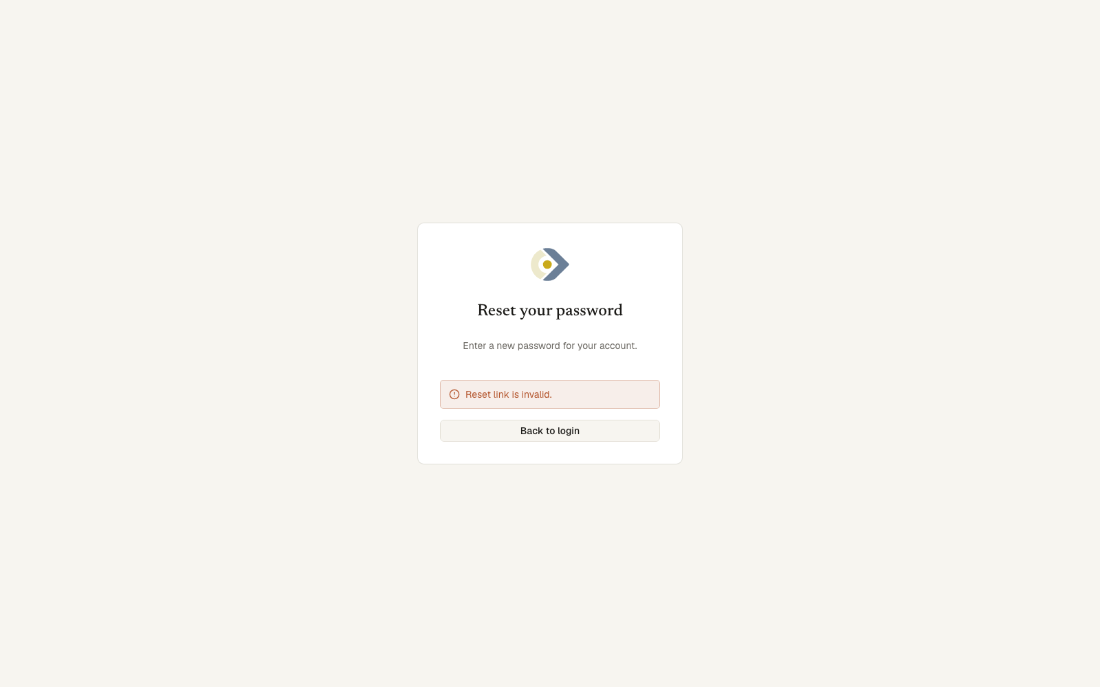
| Password reset | Reset your password | Set new password |
Both require a matching confirmation. A link that has been used or has expired is checked before the form is shown, so you get Link is invalid or expired and a way back rather than a form that fails on submit. A server that cannot be reached says so separately.
Changing your own password happens on your Profile page, not through these links.
A few routes work without any session at all: public dashboard and visualization links, the enterprise public report link, plus the invite and reset pages themselves. Everything else requires signing in.
The sidebar
The left rail is the app's map. It can be collapsed to icons (the state is remembered per browser); collapsed labels appear as tooltips on hover and keyboard focus. At the top, the brand mark links back to Home.
Sections, top to bottom:
- Ungrouped: Home, Search, Data Catalog, Discover, Favorites, then one row per configured domain (Transit, Freeways, ...).
- Library: Queries, Dashboards, and Query Snippets when that feature is enabled. Plus KPIs and Reports on an enterprise build.
- Monitor: Feed Health, Schedules. Plus Alerts on an enterprise build.
- Connect: APIs, MCP.
- Admin (admins only): Data Sources, Team, Plugins, Settings, and, for super admins, System Status, Query Jobs, and Outdated Queries. Plus Alert Destinations and Shared Links on an enterprise build.
A surface that is switched off in the instance config has no nav row at all, and its route returns a 404; Veodyn does not show greyed-out entries for things you cannot use. The same holds for an enterprise feature on a community build: the row is absent, not disabled, and nothing anywhere advertises it.
The rail's footer holds the Theme menu (Light / Dark / System), the collapse toggle, Profile, up to two outward links, and Sign Out.
The two links are separate and independently configured, so an instance may show either, both or neither:
| Link | Points at |
|---|---|
| Documentation | The product documentation site |
| Help | The operator's own support site |
Both open in a new tab, which their tooltips say, so neither loses your place in the app.
A failed sign-out is reported honestly ("Could not sign out. You are still signed in...") rather than pretending you are signed out.
Collapsing the rail
The collapse toggle reduces the rail from labels to icons and back. The choice is stored in your browser, so it survives a reload and applies to every screen, and it is yours alone rather than an instance setting.
Icon order and grouping are identical collapsed and expanded, so a row you reach for by position stays where it was. Labels move into tooltips, reachable by hover and by keyboard focus.
Command palette
Press Cmd/Ctrl + K anywhere to open a searchable palette over the same sections as the sidebar: type a few letters and jump to any screen.
Stars and tags
Two controls appear on almost every object in the product, and both work the same way wherever you meet them.
The star
Clicking the star marks an object as a favourite and collects it on Favorites. It is yours, not the object's: starring a dashboard says nothing to anyone else and does not change what they see.
The star's tooltip names the state as well as the action, reading Add to favorites or Remove from favorites, because a filled star and an empty one only read as a pair once you have seen both. On a list row the star does not open the row: it toggles and nothing else.
Queries and dashboards can be starred, and so can KPIs and reports on an enterprise build.
Tags
Tags are free text attached to queries, dashboards and datasets, and to KPIs and reports on an enterprise build. They are shared across all of them: one vocabulary, so a tag search crosses object types.
Where you may edit them, a tag row offers an **× ** on each chip and an add field with autocomplete over tags already in use. Where you may not, the chips are still there and each is a link, searching for everything carrying that tag.
Two behaviours worth knowing:
- Picking from autocomplete preserves the existing spelling. Choosing
Railfrom the list storesRail, notrail, so the object joins the tag that already exists rather than founding a near-duplicate beside it. Typing a tag that differs only in case from one already on the object is treated as the same tag and does nothing. - Tags beginning
domain:are structural. They drive domain pages and are never drawn as chips, in either mode. They stay attached through an edit, so saving tags cannot accidentally remove an object from its domain.
Inside a clickable list row, a tag chip stops the click reaching the row, so clicking a tag searches for the tag rather than opening the object it sits on.
Other shell behavior
- An offline banner appears across the top when the browser loses its connection.
- Some screens intentionally drop the chrome: print views are bare, public and embed pages render only their content, and on an enterprise build presentation mode and the wall are full-screen and dark.
- Every write shows a toast; error toasts say what to do next. Disabled controls state why they are disabled.
- Veodyn is a desktop product. A narrow window gets a minimal top bar with a navigation drawer, but the product is not designed for phones.