Ridership analytics on your captured counts
The ridership pack answers what you file: four numbers a month, by mode and type of service. This guide asks the questions those totals cannot answer: which routes are growing and which are emptying, when in the week your riders actually ride, and where boardings sit on the map you are accountable for.
Every figure below is arithmetic over counts your APC or farebox system produced; what the product adds is the history, the SQL, and the pictures.
What has to be true
The counts need grain. Monthly totals can only redraw the pack. Trends, heatmaps and maps need rows at the stop, trip or boarding level, each carrying a timestamp, a route, and a stop id or coordinates. Whether your counting system exports that grain decides how far this guide goes.
The counts also need history in a queryable table. Two ways to get it, and they are not equivalent:
- If the APC or farebox system keeps its own database, add it as a data source and query that history directly. A warehouse that already exists does not want a second copy with its own retention.
- If the source only reports current state, switch on historical capture and let scheduled reads accumulate.
For the map step, boundaries as GeoJSON and SpatiaLite on the host, the same requirements as the service equity board.
Before you start
- The ridership pack built, because its filed numbers are what step 5 ties out against.
- A data source over the counting system, whichever of the two shapes above it has.
- District or tract boundaries as GeoJSON, if you want the map.
The steps
1. Get boardings into one table
Whatever the vendor schema looks like, roll it up once into the shape
everything below reads: service date, hour, route, stop, boardings. Save that
as its own query, schedule it, and treat its result as the analytics table.
The examples below call it historical.q_apc_boardings_51; yours is named in
the data catalog.
2. Trend routes, indexed to 100
SELECT toStartOfMonth(service_date) AS month,
       route_id,
       sum(boardings) AS boardings
FROM historical.q_apc_boardings_51
GROUP BY month, route_id
ORDER BY month
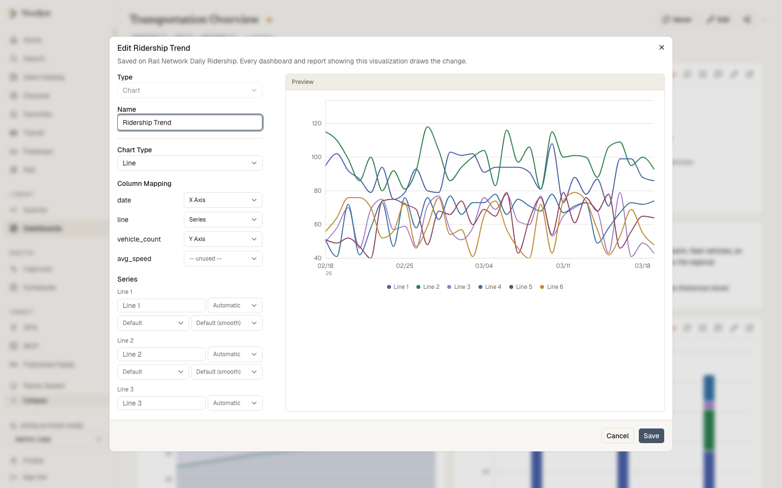
Draw it as a line chart with route_id as the series. On raw counts the busy
routes flatten everyone else into the floor of the chart, so for the "which
routes are growing" question, switch the Y axis to Index to 100: every
series is rescaled to start at 100, and the chart compares relative movement
instead of size. An indexed chart is always linear with an automatic range,
and indexing is unavailable while stacking is on; the editor says so rather
than letting the two fight.
3. The hour-by-day heatmap
SELECT toDayOfWeek(service_date) AS weekday,
       hour,
       avg(boardings) AS avg_boardings
FROM historical.q_apc_boardings_51
GROUP BY weekday, hour
Add a Heatmap visualization: weekday on one axis, hour on the other, average boardings as the value. Use the row sort so the days come out in week order rather than alphabetically; value labels hide themselves on a grid this dense, which is fine, since the shape is the finding.
Decide first what a day means. A trip that boards at 12:40 am belongs to the previous service day in most scheduling systems and to the next calendar day in a naive timestamp. Either convention works; pick one, apply it in the rollup, and say which one the widget title uses.
4. Boardings on your own map
Sum boardings by stop, then assign stops to your districts with a spatial join and shade the result:
SELECT b.name          AS district,
       b.geometry      AS boundary,
       sum(s.boardings) AS boardings
FROM cached_query_12 b
JOIN cached_query_56 s
  ON ST_Within(MakePoint(s.stop_lon, s.stop_lat), GeomFromGeoJSON(b.geometry))
GROUP BY b.name, b.geometry
Then a Choropleth in geometry-column mode draws one region per row. The full method, the controls, and what the join costs are in the service equity board; the one addition here is about scale. The spatial predicate has no index behind it, so run it over the few hundred distinct stops, not the millions of boarding rows: aggregate boardings per stop first, join stops to districts once, and any per-period variant joins on plain stop id equality afterwards.
5. Put it on one board and tie it out
One dashboard: the indexed trend, the heatmap, the map, and a counter for the month's total. Schedule the queries behind them so the board is not recomputing joins on every open.
The counter is not decoration. It is the reconciliation: the sum of the analytics table for a filed month should agree with the UPT the pack's reconciliation step already checks. When it does, every chart on this board inherits the filing's credibility; when it does not, the gap is the first analytics finding.
How you know it worked
Pick a month you have already filed and compare the analytics total against the filed figure. Then check coverage in the data catalog: the first and last timestamps the table holds. A trend chart that starts partway through a month usually means the history starts there too, not that ridership did.
What takes it off the air
| What happened | What you see |
|---|---|
| Capture was switched on mid-period | Trends that begin abruptly; the catalog's coverage dates say when |
| A retention TTL shorter than the comparison | An Index-to-100 chart needs last year in the table, so year-over-year needs at least 13 months retained |
| Routes were renumbered upstream | Series that end and unfamiliar ones that begin at the same date; only a mapping table you maintain can splice them |
MakePoint got latitude first | An empty map with no error anywhere; longitude comes first |
| The vendor schema changed | Captured columns widen into _str variants instead of failing, so a chart's column quietly stops filling; see history capture |